Client
Fibr
year
2019
Role
Art direction
Art direction
Art direction
Art direction
Helping fibr Build a recognizable brand and it's digital presence.
Helping fibr Build a recognizable brand and it's digital presence.
Helping fibr Build a recognizable brand and it's digital presence.
Helping fibr Build a recognizable brand and it's digital presence.
Helping fibr Build a recognizable brand and it's digital presence.
The challenge
I was asked to help some friends to develop a brand, website & packaging for an emerging lifestyle product aiming to distrupt the fiber nutrition market. Fibr aims to reach new target groups by infusing a number of easily snackable products with fiber for people on the go.
The approach
Being a digital designer I approached it holistically, looking at all formats together, trying to find a workable visual language that was recognizable across platforms, from digital to physical. Being a new start-up, funds were limited so I had to work with a tight timeline in order to deliver. By including the client in the process by giving to access my Figma files they were able to add copy and input easily and give feedback when needed. I used Semplice, a Wordpress builder to make the front-end, saving us lots of development time
The learnings
Working with friends is always a challenge, and a test of that friendship. If it’s possible to separate work and private life it can be very fun! A big challenge was that the client didn’t have a clear idea of the message or tonality when we started, which created a flow of unstoppable iterations at one point. Here I had to stop and make sure that they new what they wanted before we’d continue so the budget wouldn’t be drained too fast.
The result
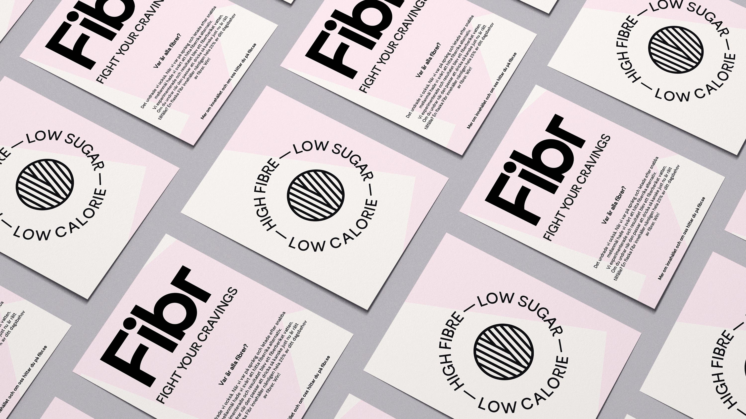
A simple visual language with quirky typography, blocky shapes and soft colors made to be scalable over time by adding hues when new flavors are added. All background & visual elements are easily animated which caters for a strong digital presence in the future.
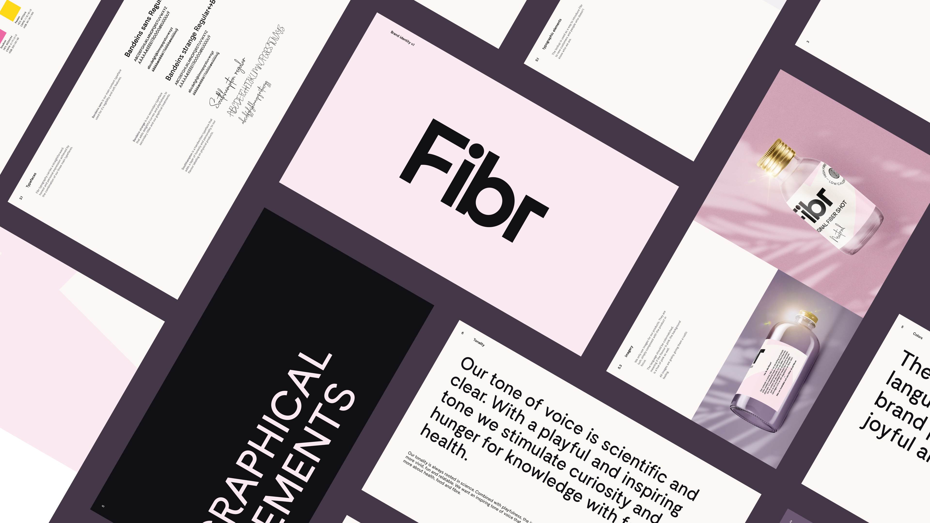
Overview of the identity deck provided to the client.
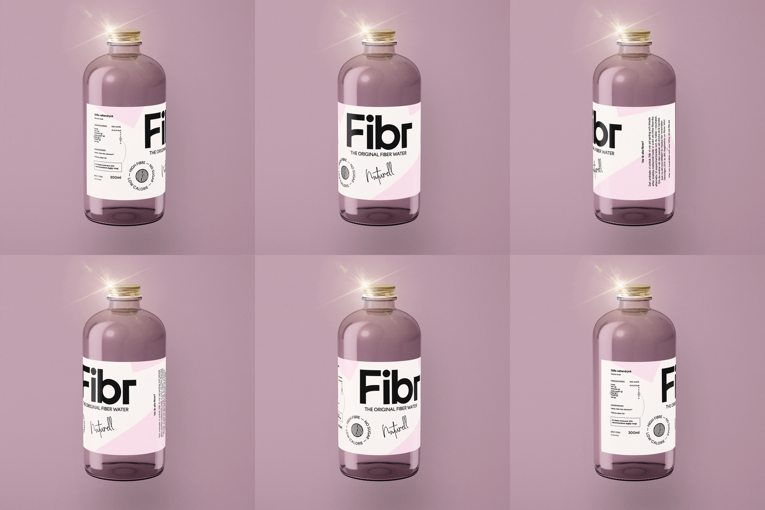
Labeldesign for the 300ml bottle.
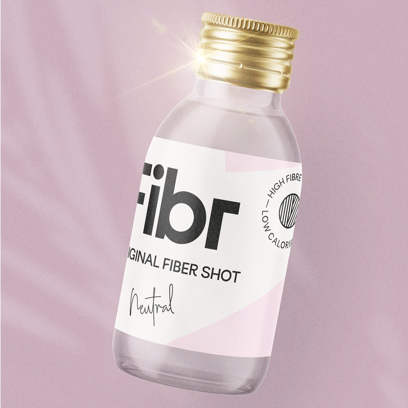
Labeldesign for the 100ml shot bottle.
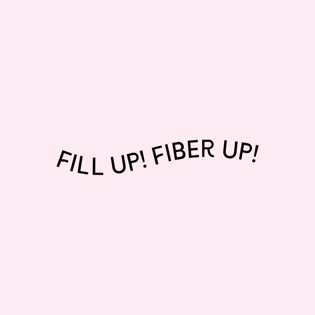
Example of a graphical element that can be used for digital channels.
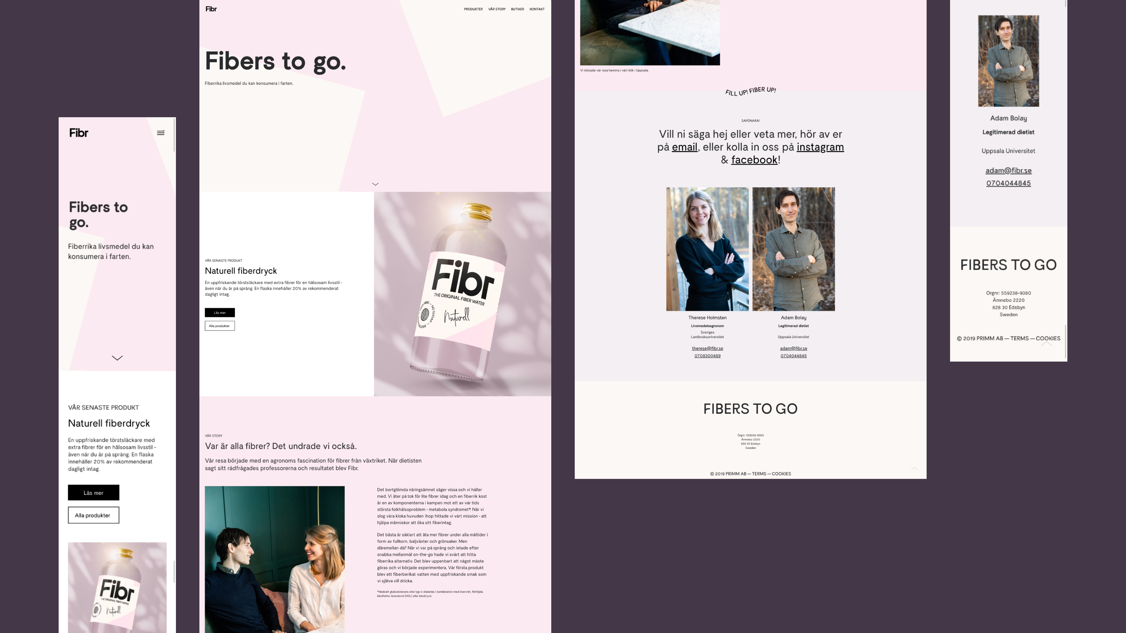
Overview of the website.
Overview of the website.
Overview of the website.
Overview of the website.
Overview of the website
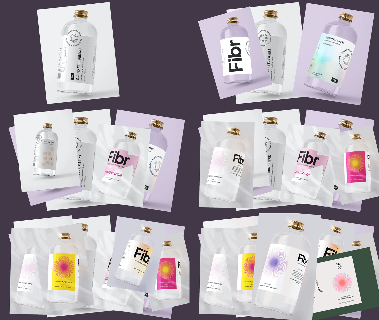
Process of different visual styles explored throughout the project!
Selected Works
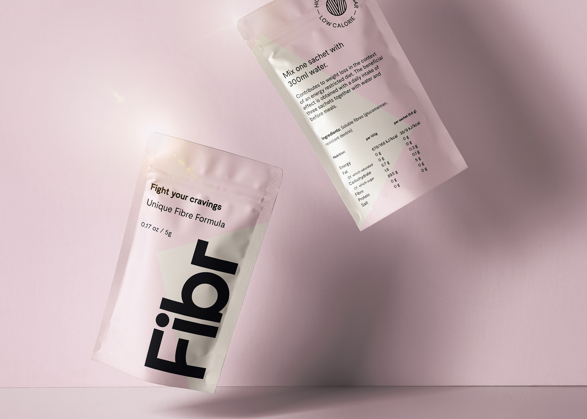
Fibr - Fight your craviingsIdentity, Packaging, visual design
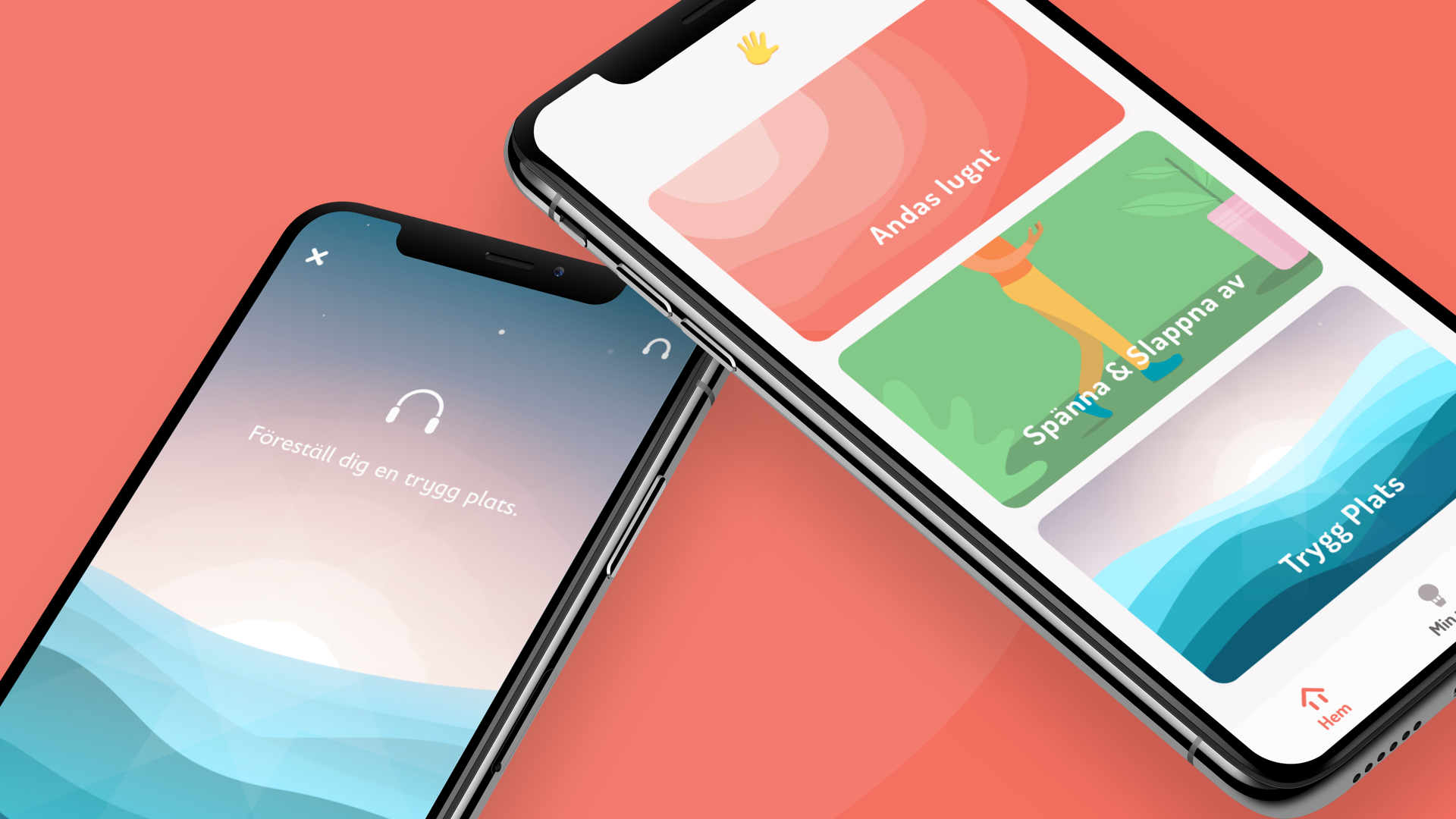
Rädda Barnen - Safe PlacesCreative direction, Visual design, development
NikeVisual design
SennheiserArt direction
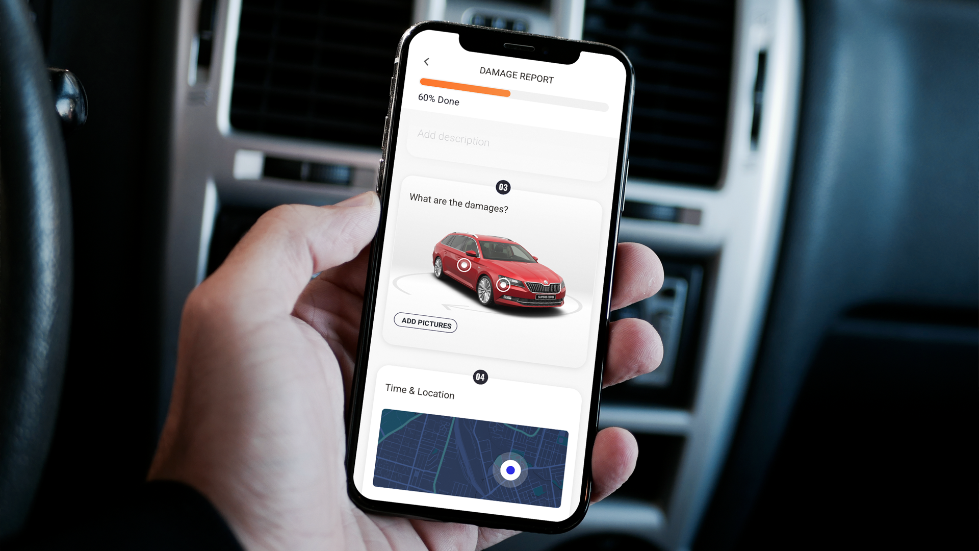
BMW AlphabetVisual design, Concept design
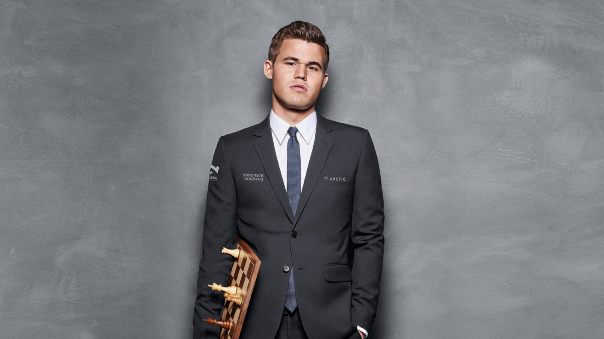
Play Magnus - Magnus trainerArt direction, Visual design, Concept design
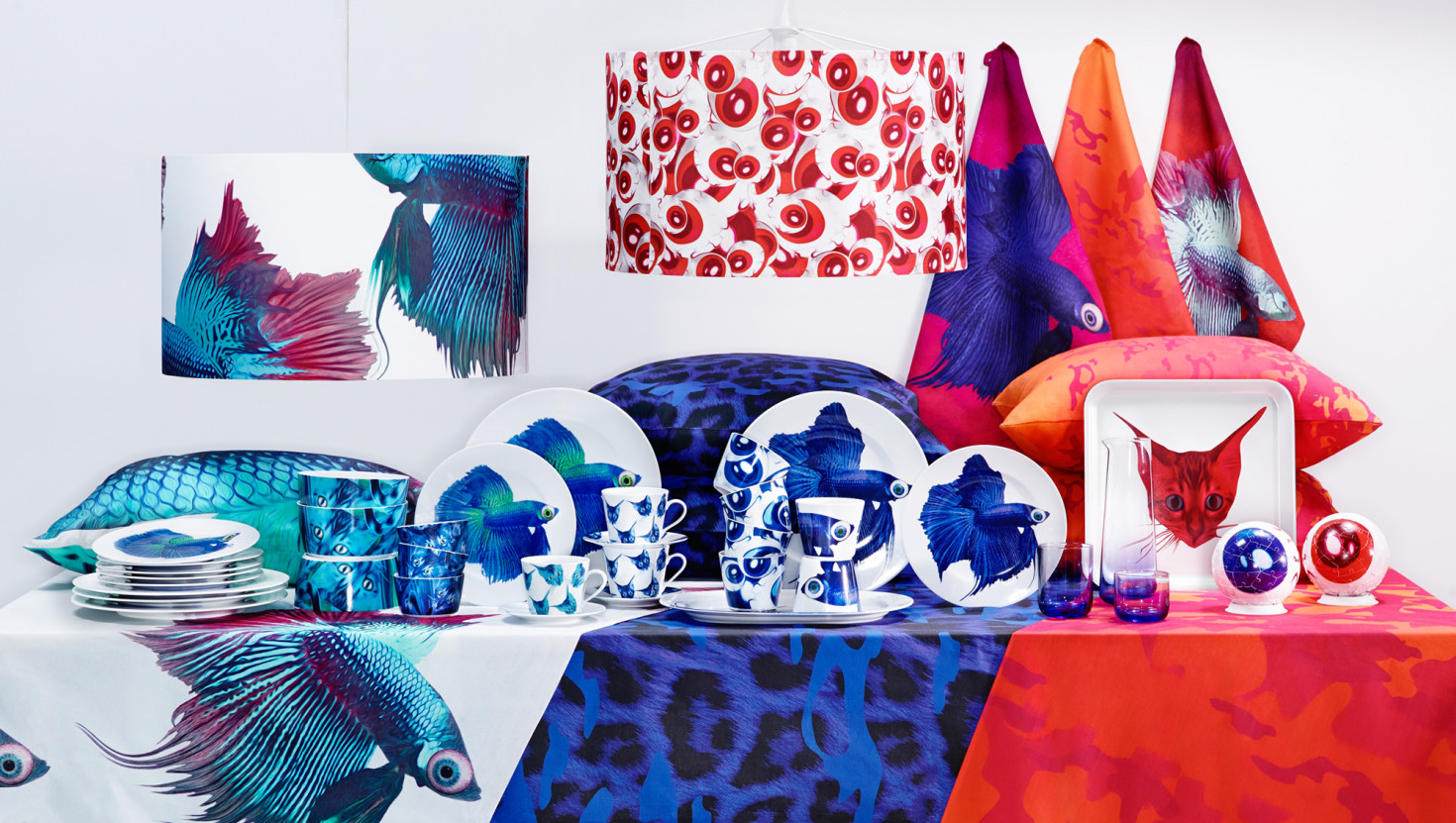
IKEA - Giltig collectionArt direction, Visual design, Concept design
© 2020 Billy Morén. All Rights Reserved
© 2020 Billy Morén. All Rights Reserved
© 2020 Billy Morén. All Rights Reserved
© 2020 Billy Morén. All Rights Reserved