Client
Rädda Barnen
year
2018
Role
Creative direction & visual design
Creative direction & visual design
Creative direction & visual design
Creative direction & visual design
Helping rädda barnen conceptualize, build and launch a successful app for kids with ptsd
Helping rädda barnen conceptualize, build and launch a successful app for kids with ptsd.
Helping rädda barnen conceptualize, build and launch a successful app for kids with ptsd.
Helping rädda barnen conceptualize, build and launch a successful app for kids with ptsd
Helping rädda barnen conceptualize, build and launch a successful app for kids with ptsd.
Rädda Barnen came to us with a need to help them make a product for kids (age between 13-25) that have post traumatic stress disorder. A product they could use when they felt stress creeping in and something to use to calm down and feel better in the moment, but also a tool to improve wellbeing over a longer time span.
We helped slim down the scope to three exercises and define features that adresses app engagement & user retention to make sure people come back to use the app.
Over the span of 2 months, a team of two developers, me and a product owner created a concept, tested different features and exercises with users, designed, built (with react native) and launched!
A personal challenge and accomplishment was to make the app as small as possible, in order to decrease the bandwidth for the kids who often uses a pre-paid card and limited data. We did this by creating all visuals and animation with lottie (https://airbnb.design/lottie/) making the application lightweight and snappy.
A minimal, simple product that is solving the key issues a Visual Merchandiser have to deal with in their daily work. By creating a sleek platform where all people involved: management, the visual merchandisers and the teams updating collections, could add their content and slipstream their workflows greatly.
I wanted to create a minimal and utilitarian experience that have a clear focus on solving the needs, but still making it feel Nike by keeping the Trademark Nike headline font and using strong, clean colors and graphics.
My tasks ranged from setting up a design language that worked well both in native ios, android and web environments, and making sure that the design was aligned to the Nike brand.
This was definitely a team effort! The team consisted of Michael Rosenberg (PO), Jesper Svenning (UX design), Erik Alfredsson (iOS developer), Mikael Johansson (Android developer) and Alexander Björk (web developer).
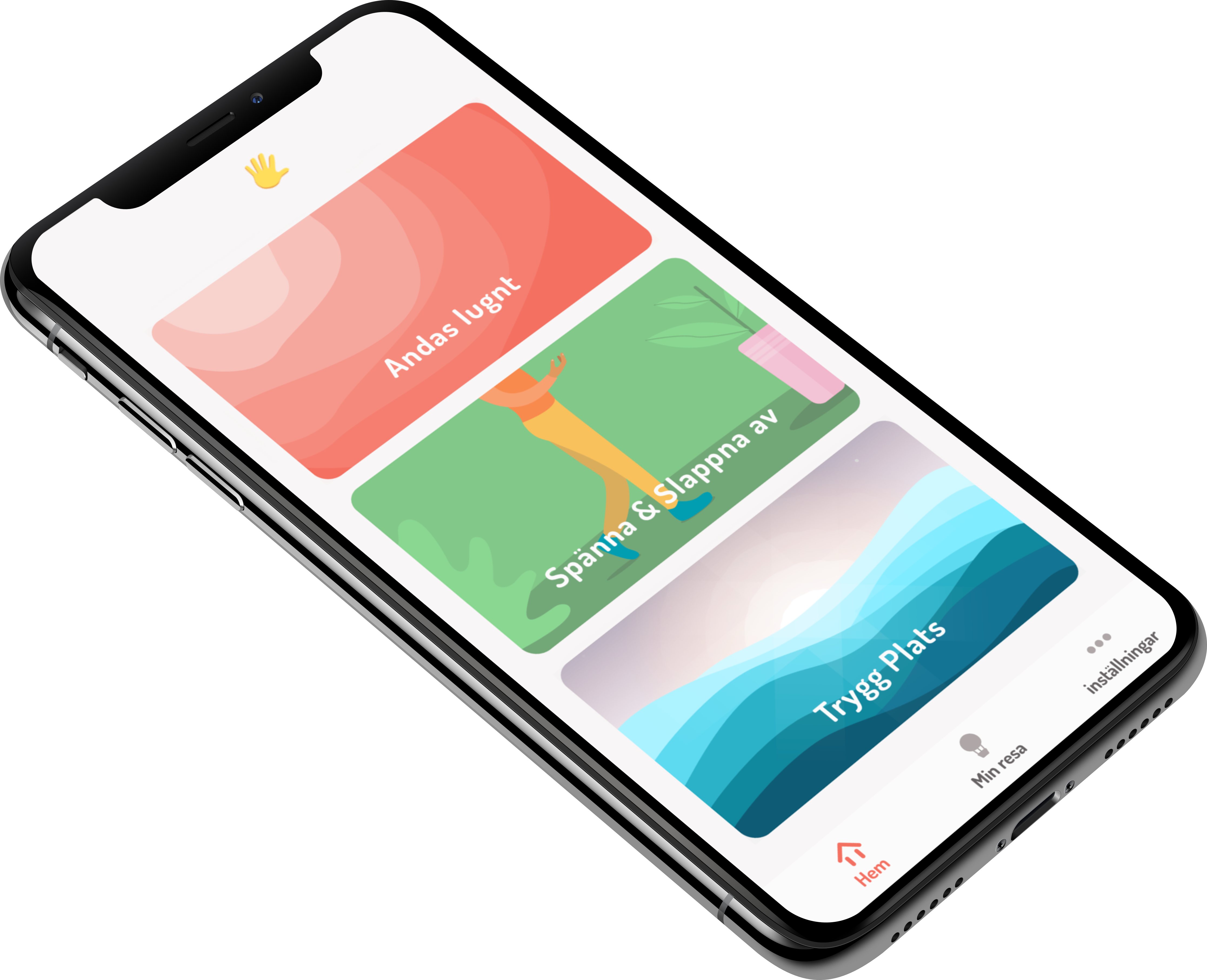
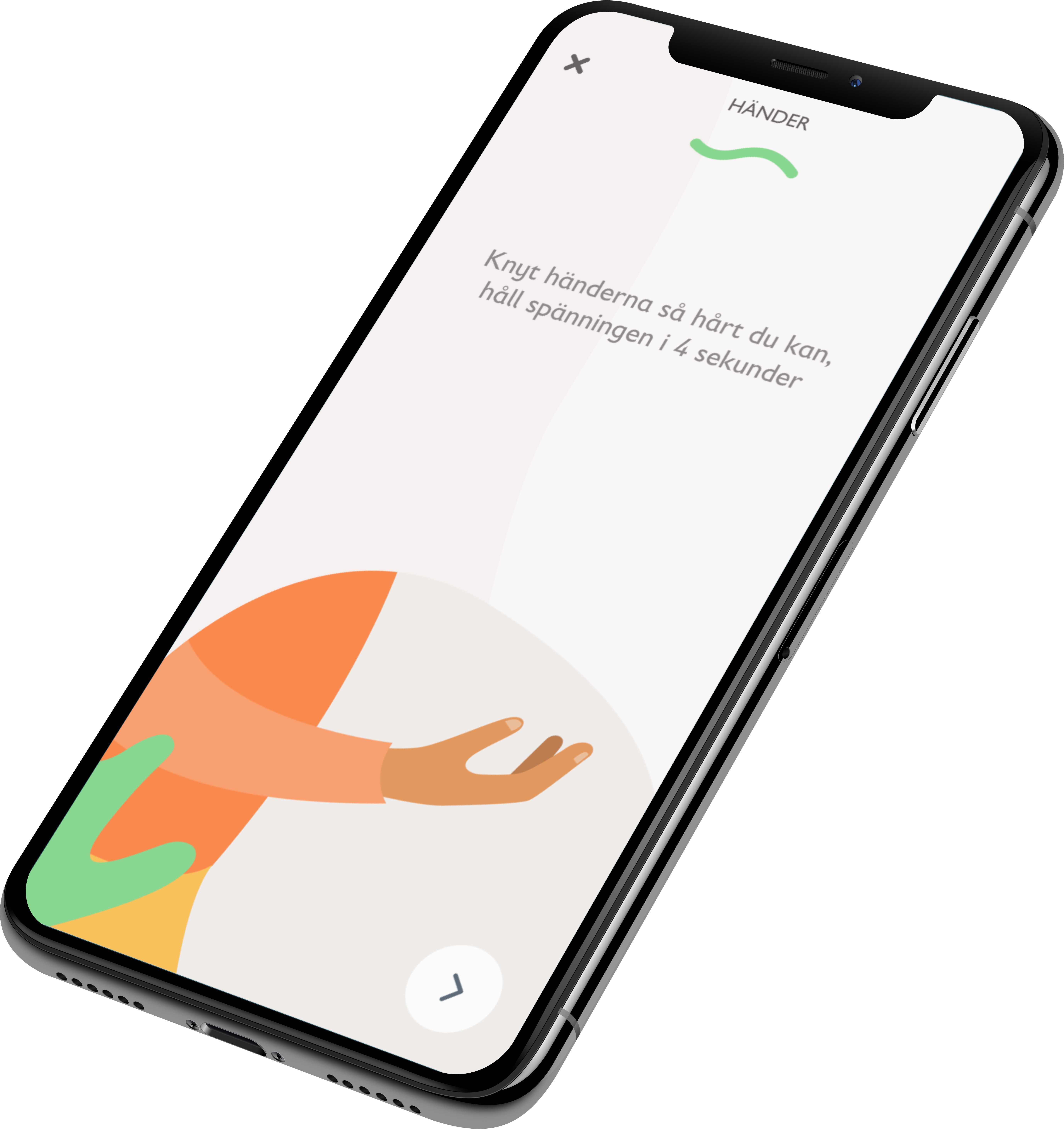
A guiding exercise called tense & relax that guides the user through all body parts, instructing when to tense your body, and when to relax.
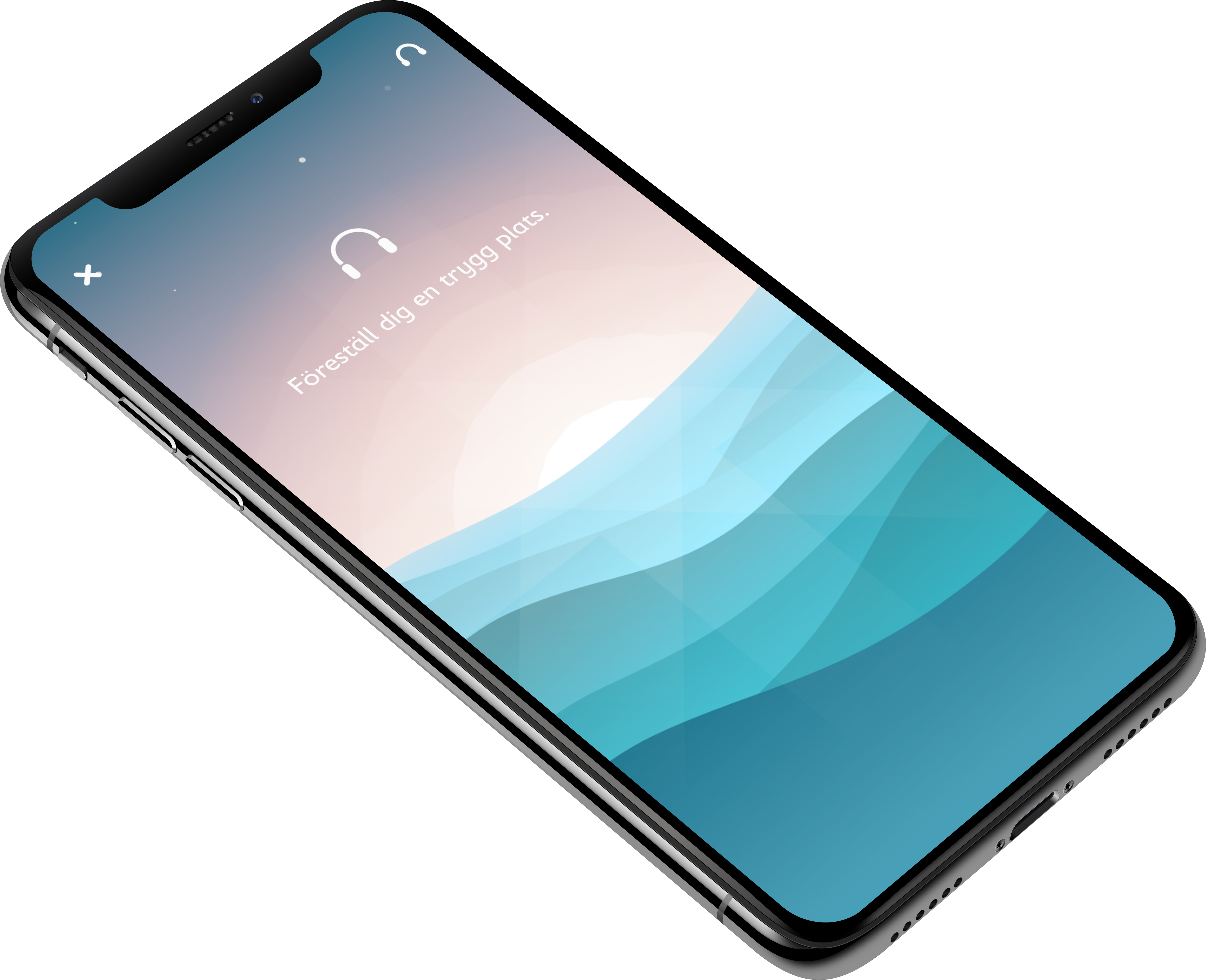
Safe places exercise helps the user relax by giving an audio/visual experience where you can relax, go inside yourself and visualize a safe place that you can escape to whenever needed.
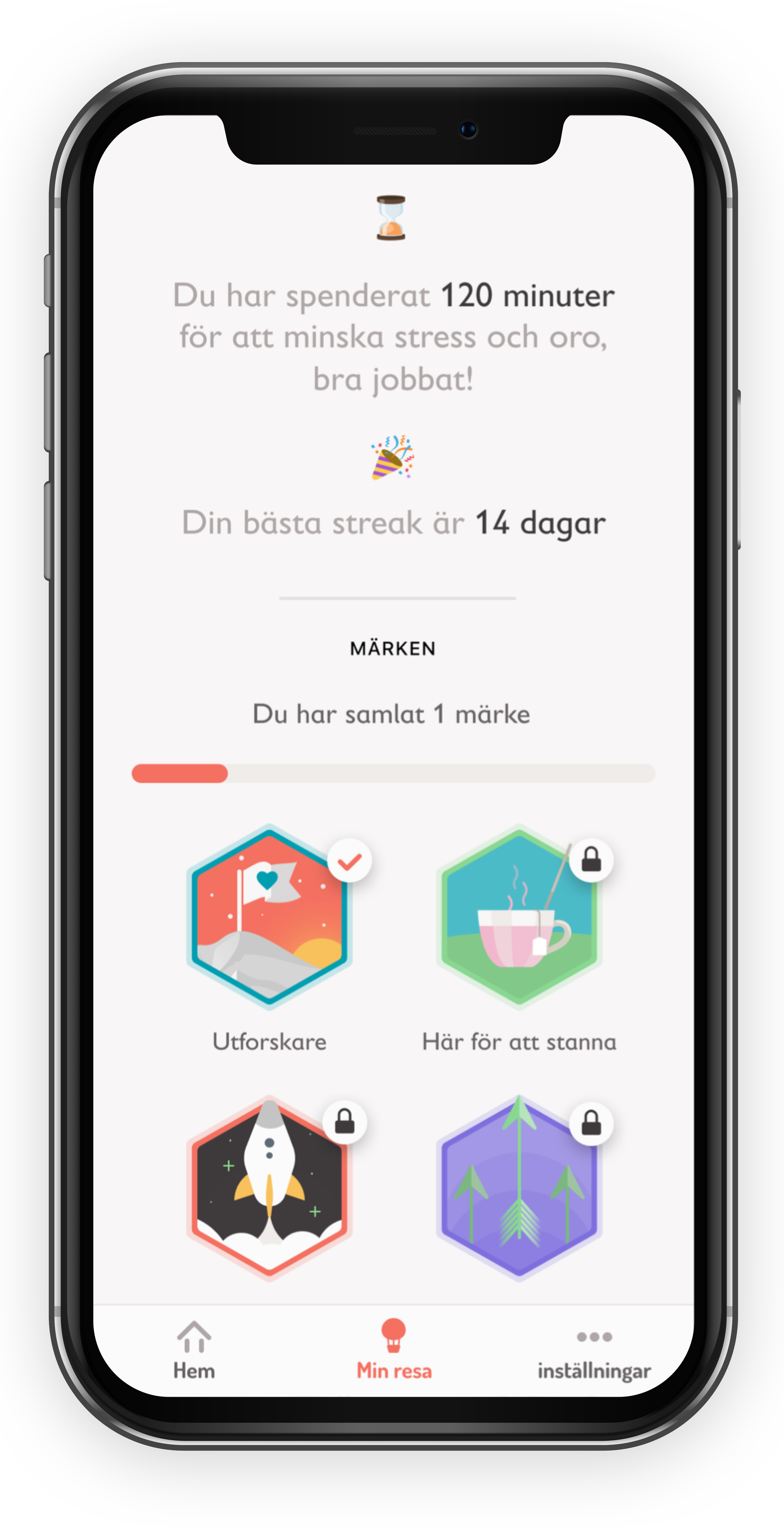
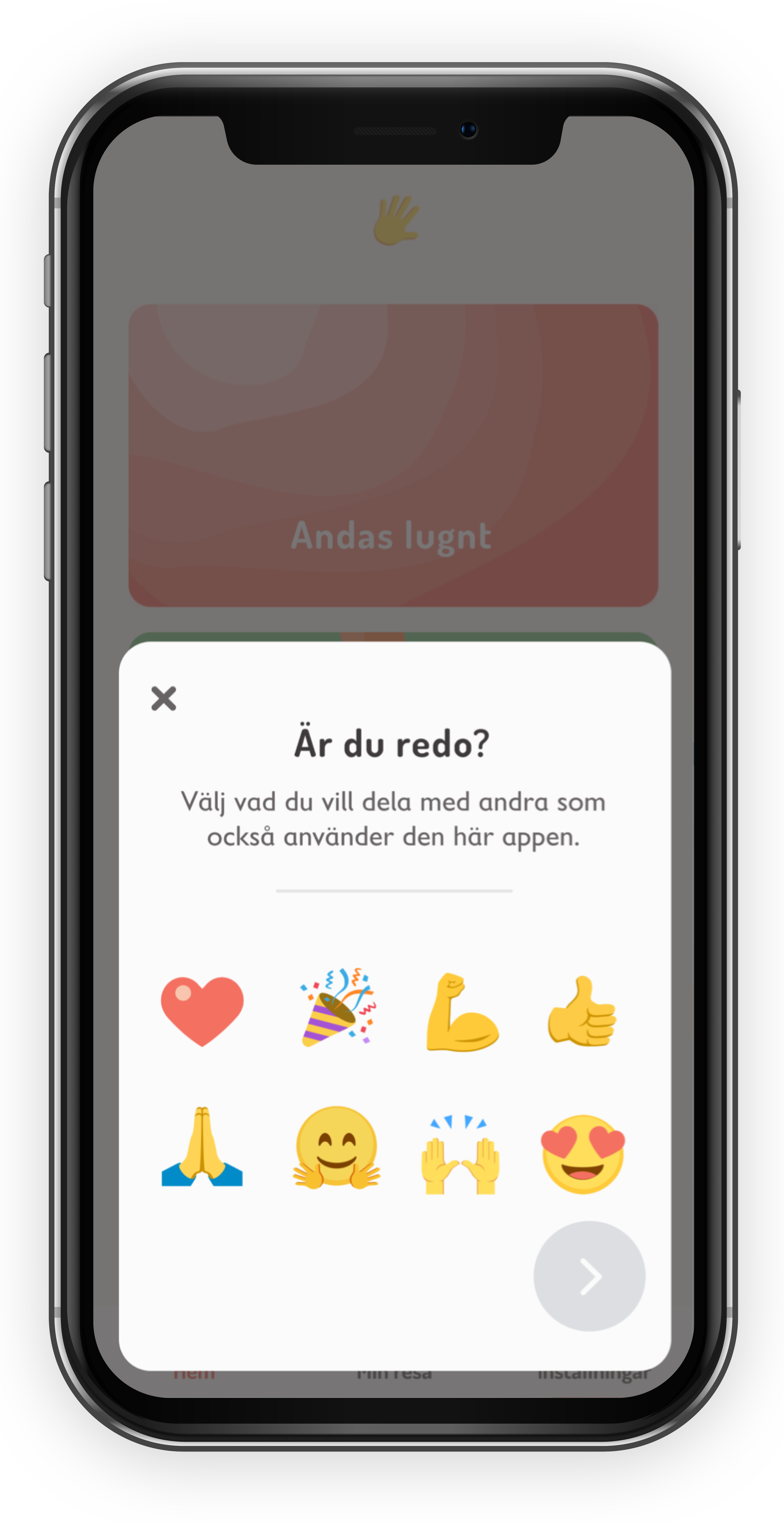
To help with app engagement we introduced a streak system together with badges, to softly engage users to keep using the exercises.
The most popular feature in the app is the 'lovebomb'. It let's people anonumously send love (a selection of emojis) to other people which they see animating on the screen when they open the app the next time. This is a way to create a sense of community and belonging.
The app is available on all good app stores, it's called Safe Places 
The app is available on all good app stores, it's called Safe Places 
The app is available on all good app stores, it's called Safe Places 
The app is available on all good app stores, it's called Safe Places 
Selected Works
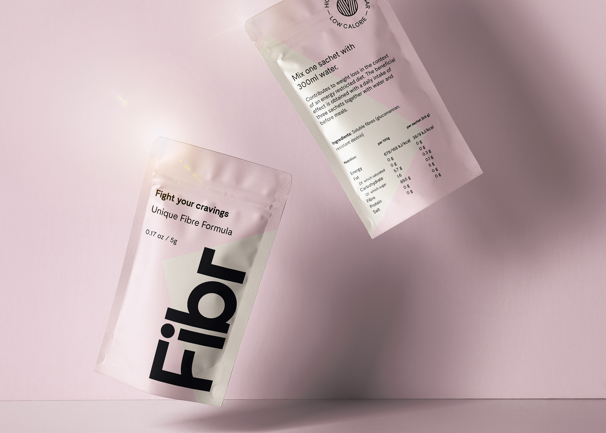
Fibr - Fight your craviingsIdentity, Packaging, visual design
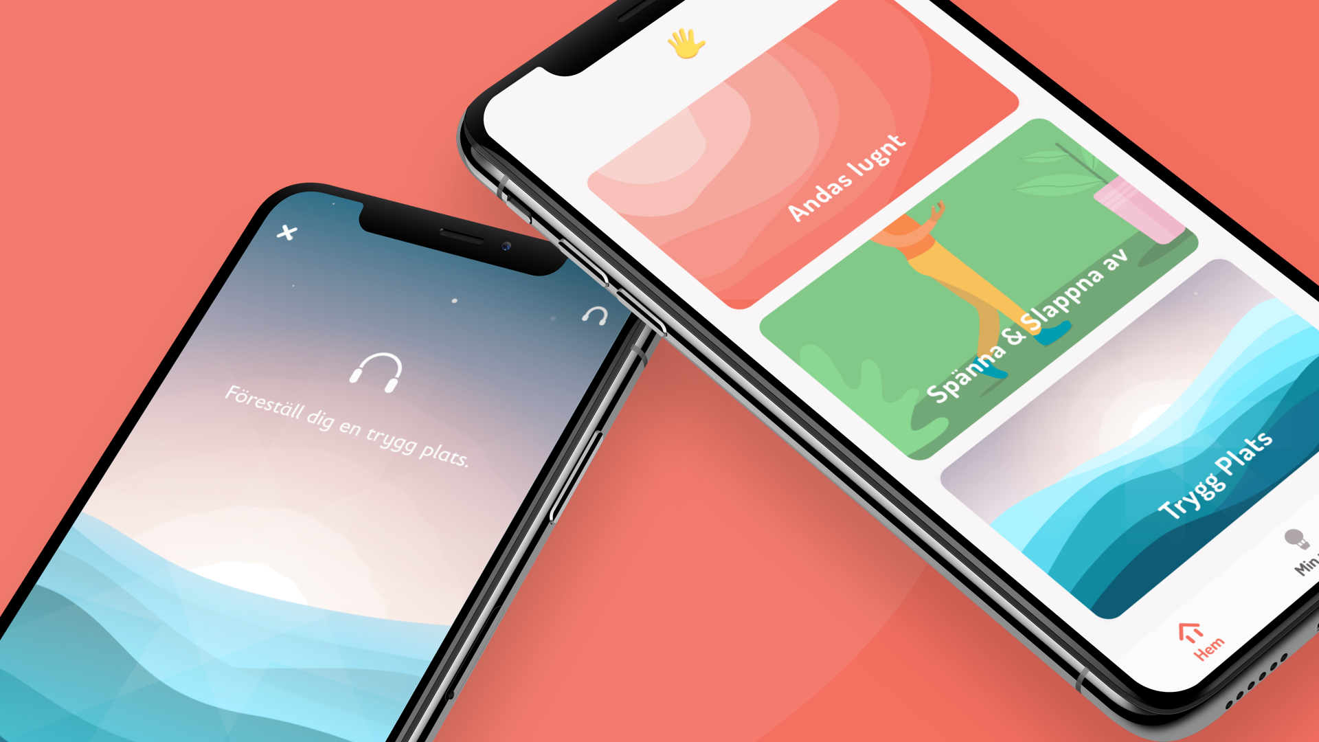
Rädda Barnen - Safe PlacesCreative direction, Visual design, development
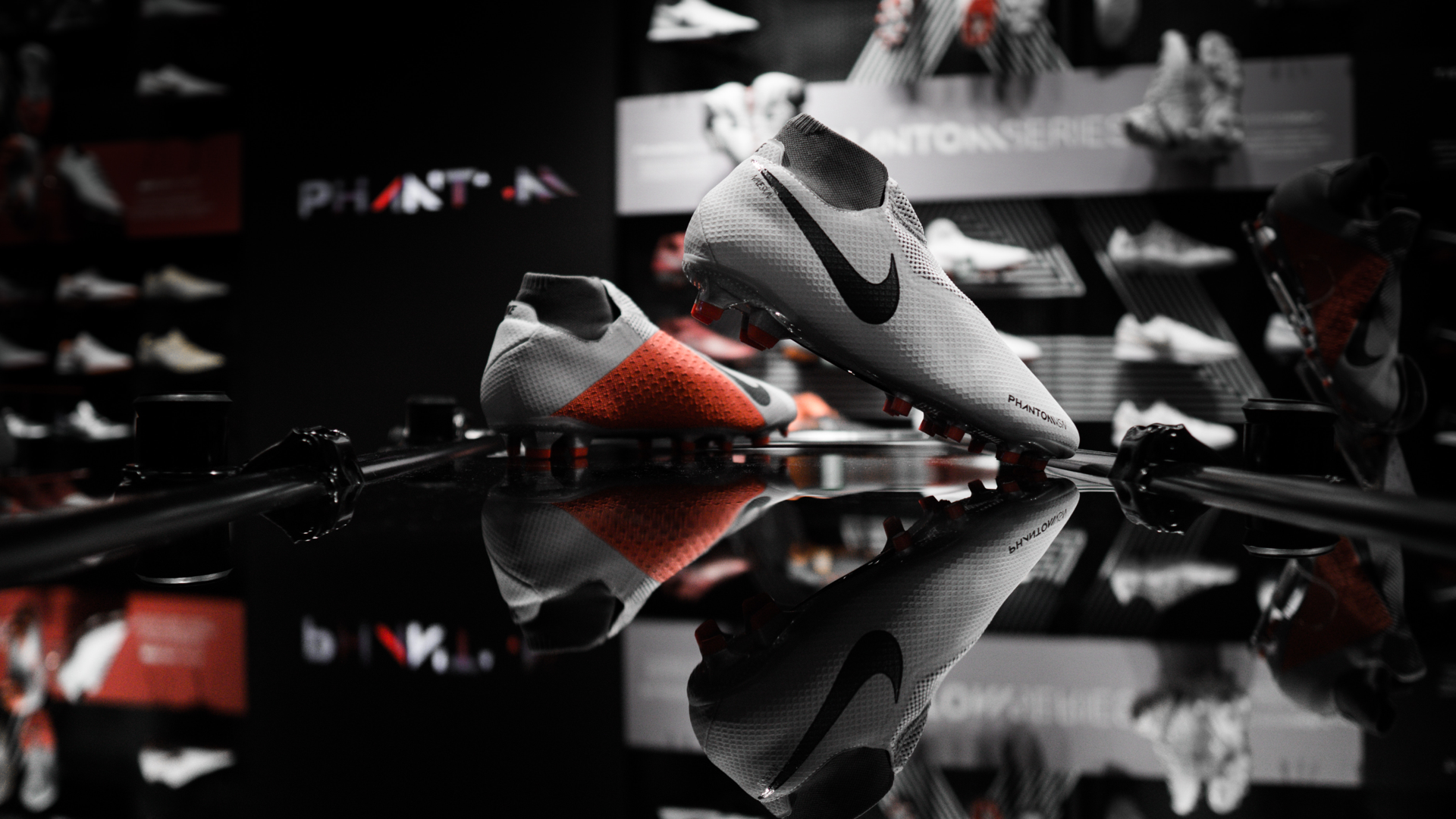
NikeVisual design
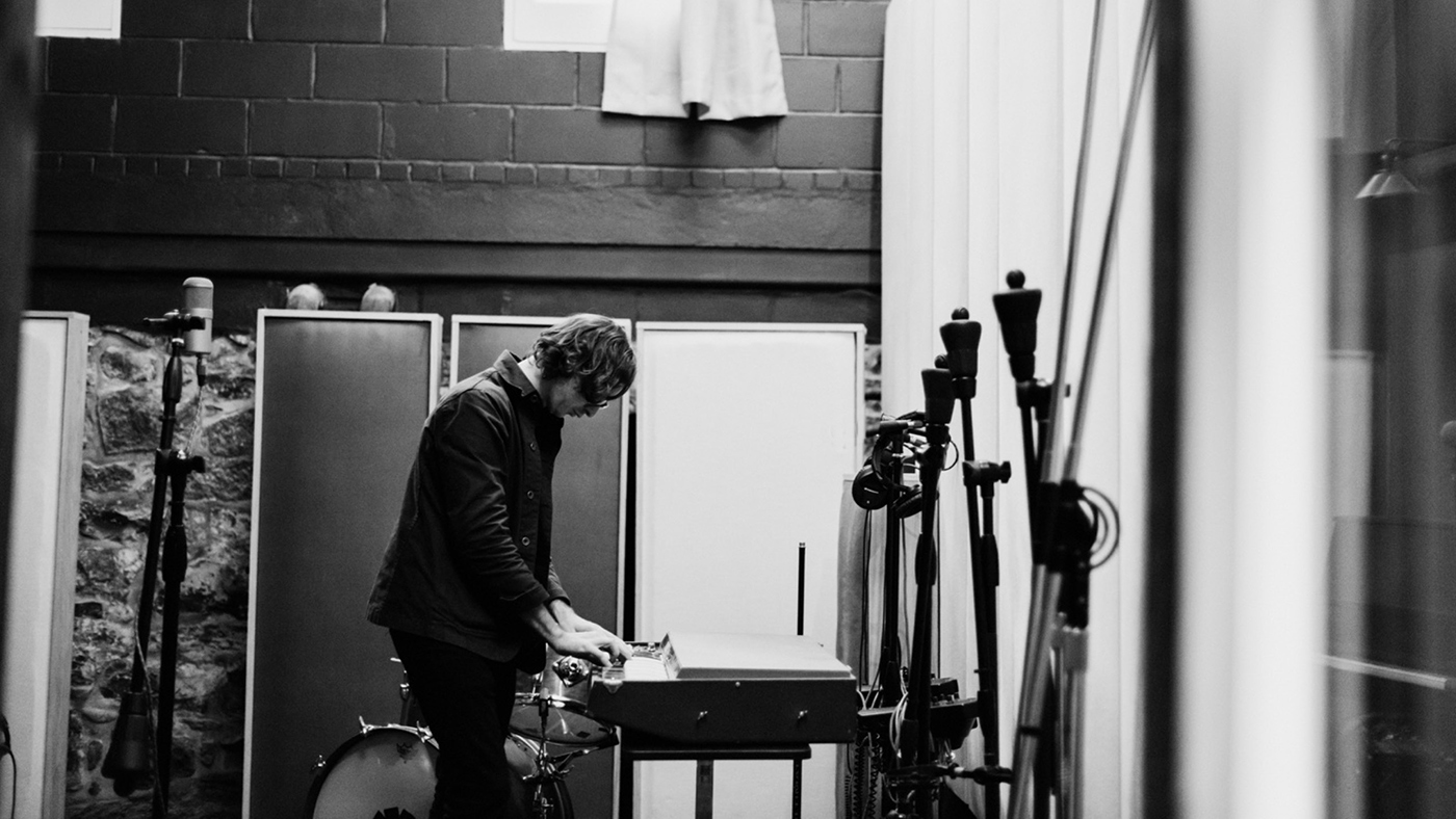
SennheiserArt direction
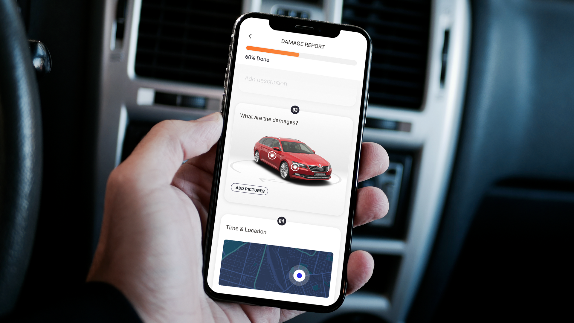
BMW AlphabetVisual design, Concept design
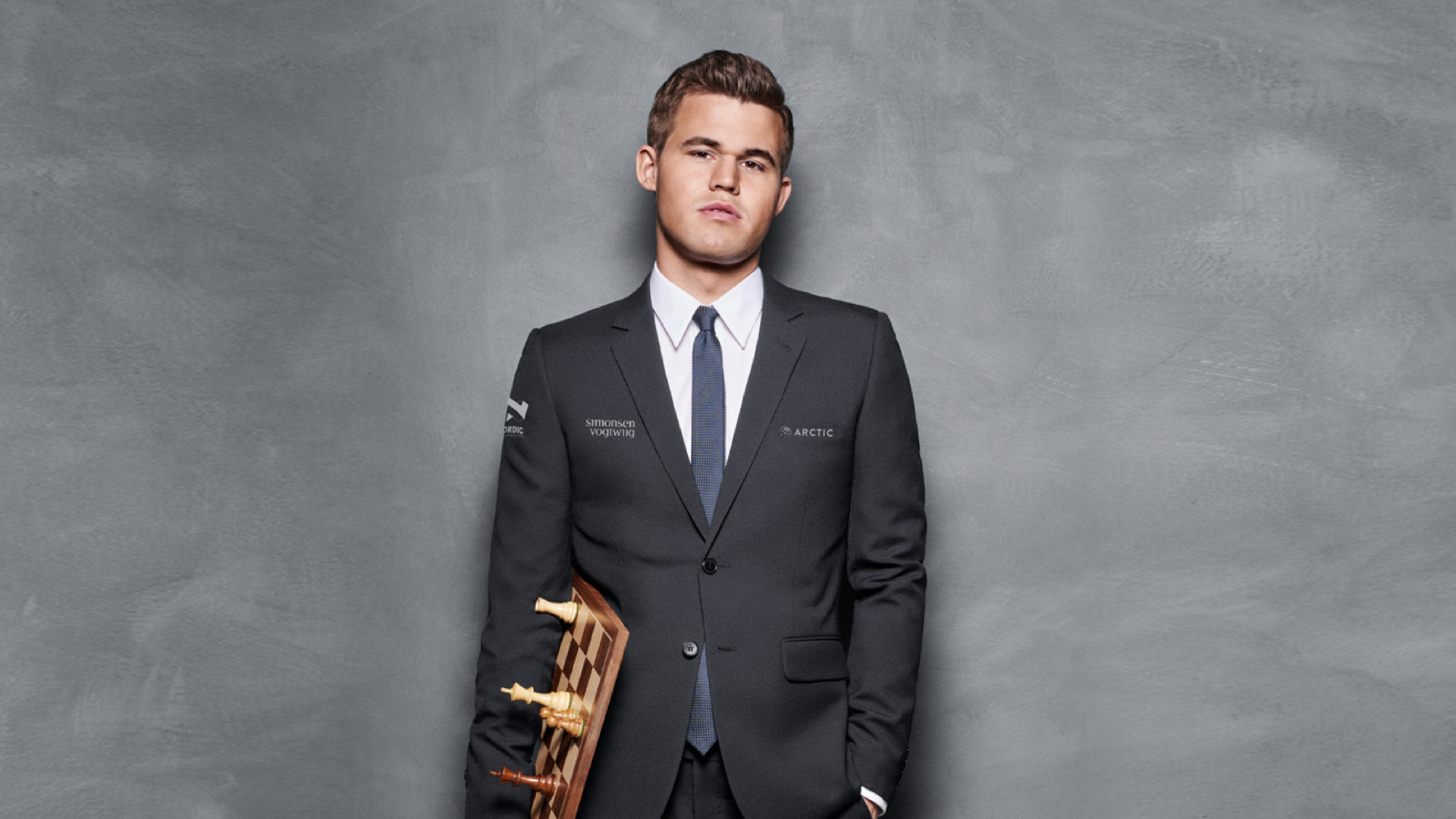
Play Magnus - Magnus trainerArt direction, Visual design, Concept design
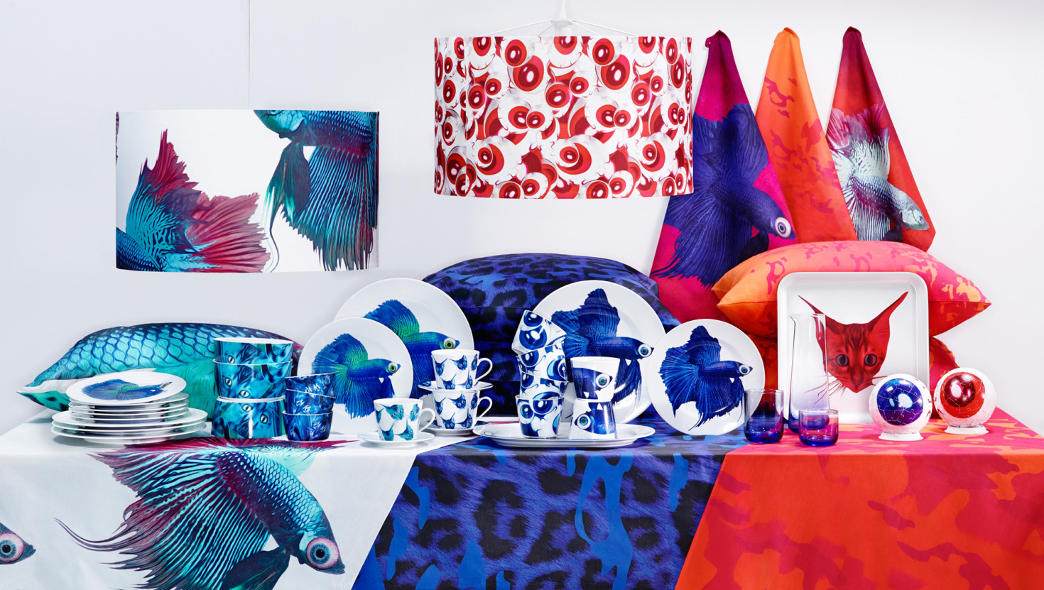
IKEA - Giltig collectionArt direction, Visual design, Concept design
© 2020 Billy Morén. All Rights Reserved
© 2020 Billy Morén. All Rights Reserved
© 2020 Billy Morén. All Rights Reserved
© 2020 Billy Morén. All Rights Reserved